Category: Tutorials
-
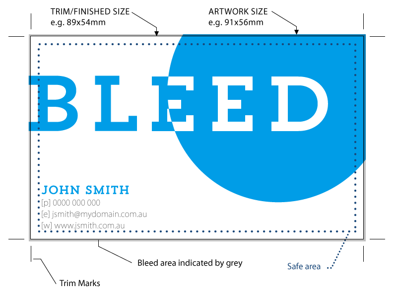
Bleed & offset printing – what is bleed and how to set it
What is Bleed? So what is bleed and why do I need it you ask, well bleed is a small area on the outside of the trim marks but before the edge of the printed material. Why do I need bleed? This bleed exists to prevent the possibility of a small white gap at the…